In a piece on Watts Up With That, Eric Worrall explored the relationship between atmospheric CO2 and temperature. (Yes, yes, I know the science is settled, but the fact is the only thing settled is the pseudo-science nesting in the fetid imaginations of climate “science” funding industry personages. The rest of us keep asking rude questions.)
Using data consisting of meteorological records back to the 1850s and other data collected from sources like “isotope ratios in gas samples extracted from ice cores and seabed cores,” temperature records of Earth dating back hundreds of thousands of years (ice core data from Greenland and Antarctica reach back 400,000 years, for example), Worall was able to generate an interesting pair of graphs. The upper graph of the two-parter below is one such easily constructed graph. The red dotted line at the end of the measure period is the current “warming” put in context.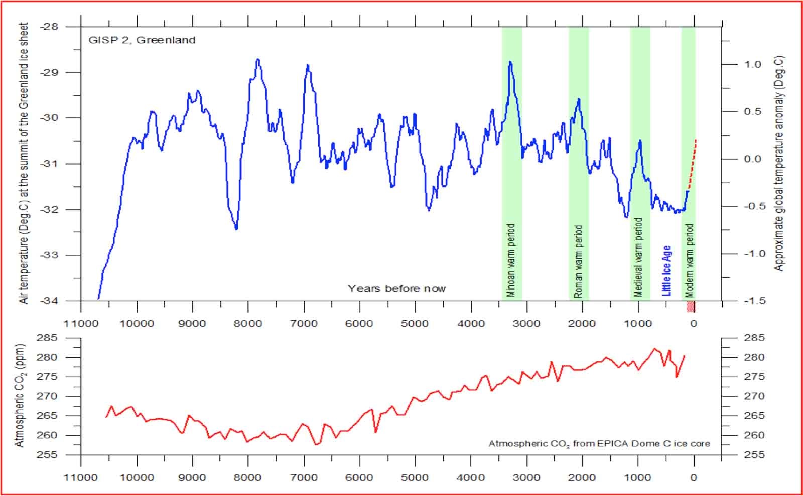
Figure 1. After Professor Bob Carter (lecture at the 10th International Conference on Climate Change at the Heartland Institute on June 12, 2015). Air Temperatures above the Greenland ice cap for the past 10,000 years reconstructed from ice cores using data from Alley, 2000 (The Younger Dryas cold interval as viewed from central Greenland. Quaternary Science Reviews 19, 213-226) (top panel), with a time scale showing years before modern time. Lower panel shows the carbon-dioxide concentrations of the atmosphere over the same period from EPICA Dome C ice core.
The caption of the graph gives the data source for the lower graph: they’re from ice core data collected by the European Project for Ice Coring in Antarctica from the Antarctic Plateau.
A number of things jump out at me about this graphed relationship between temperature and the atmosphere’s CO2 content.
One is the clear cyclical nature of global temperature. There clearly is more going on with planetary temperature than any putative CO2 pumping.
Another is the absolute lack of relationship between temperature and CO2 in our atmosphere. Atmospheric CO2 was at its nearby (as such things go on a geologic time scale) low when temperature cycles were achieving apparent highs over the 11,000 years presented. While atmospheric CO2 has been rising since that low, it has been doing so more or less slowly and steadily, especially compared with the wild (relatively) swings of the temperature cycles.
Another goes back to the upper, temperature graph. The average planetary temperature over the geologic time frame sure looks like it’s been decreasing, slightly, across the period. While the atmospheric CO2 content has been rising.
And one more thing: that current rise in temperature represented by that dotted red line. It’s indistinguishable from any of the other sharp rises into a warm cycle.
Settled, indeed.