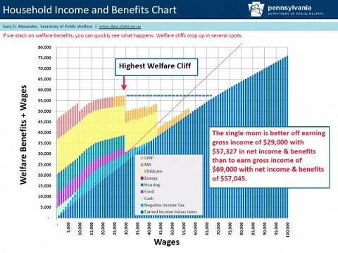
I, among a number of other folks, wrote about this a short while back.
Following is the money graph from that post, from the perspective of the present post:
Here’s another perspective on the matter, the point of “present post,” from AEIdeas‘ James Pethokoukis, who cited John Merline’s article for the Richmond Fed.
Writing about the “decline in labor force participation as a result of reported illness or disability,” Merline had this [emphasis added]:
Another driving force, Autor and Duggan found, is the fact that the value of disability benefits relative to wages has risen “substantially” since the late 1970s, because of the way initial benefits are calculated. That’s particularly true at the lower end of the income spectrum. When the value of SSDI benefits and the value of the Medicare benefits that SSDI enrollees qualify for are combined, the share of income replaced by the disability program climbed from 68% in 1984 to 86% in 2002 among lower-income men aged 50-61.
That’s an enormous marginal tax rate that must be paid in order to get a better job.

Pingback: Why Not All of Them? | A Plebe's Site
Pingback: “About That ‘Gutting the Safety Net’” | A Plebe's Site
Pingback: Wealth, and Wealth | A Plebe's Site