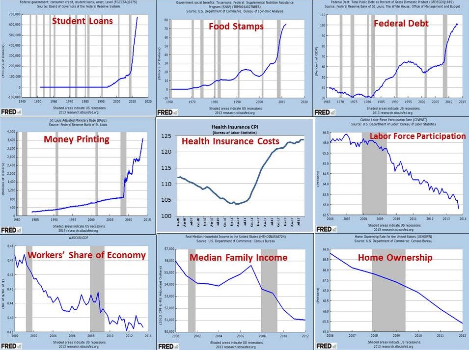
The Obama Recovery Posted on 21 September 2015 by eehines From ZeroHedge, this summary, in nine charts.Right click on the image to enlarge it.
 Right click on the image to enlarge it.
 Right click on the image to enlarge it.