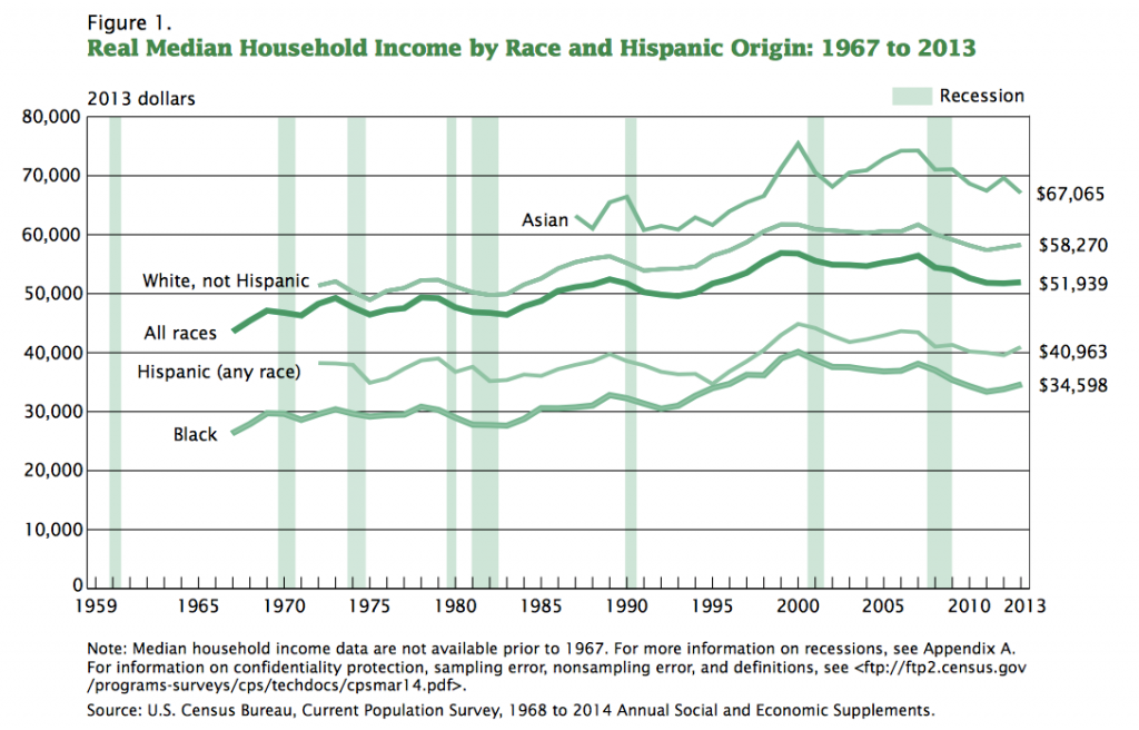
This one is from the Census Bureau’s Income and Poverty in the United States: 2013. The headline of the report is that American household median income stagnated for the second straight year and remains, in real terms, 8% lower than it was in the last year before the Panic of 2008. The graph below reflects that.
What interests me about this graph, though, is not the end result snapshot, but the slopes of the graph’s separate lines, the changing levels of median incomes, as we come out of recessions and panics over the last 50 years.
Notice: coming out of nearly every one those dislocations, either immediately after it was over or shortly after, the slopes are up. Median household income recovered quickly for all groups indicated. To be sure, there were some significant lags in this—blacks often, Hispanics coming out of the 1990 mini-recession, for instance. However, even coming out of the 2000 dot-com bust, incomes “merely” stagnated overall (although with that one, incomes didn’t fall very much, either).
But coming out of the Panic, this administration’s policies have set a new record for holding back a recovery—incomes have not stagnated (would that we’d done that well); they’ve been pushed down.
