Here are some graphs of how well President Barack Obama’s regulations and economic policies have been working since he exploded our national debt with his “Stimulus” package in 2009. The graphs come from Southern Methodist University Cox School of Business’ Maguire Energy Institute.
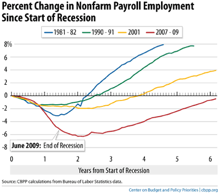
First, the sad classic graph of how the Obama Recovery compares with past recession recoveries. It speaks for itself.
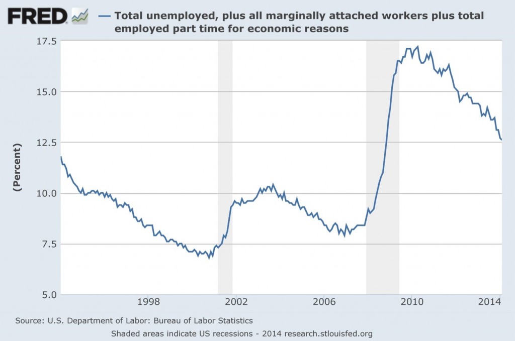
This graph shows the total number of Americans still unemployed—the flip side of the number of Americans who actually have jobs.
Like the classic above, things are improving—hence “recovery”—but unemployment still is at historic highs when we consider the number of Americans that make up the unemployed 6.3%. This is because our population is growing faster than the number of jobs available.
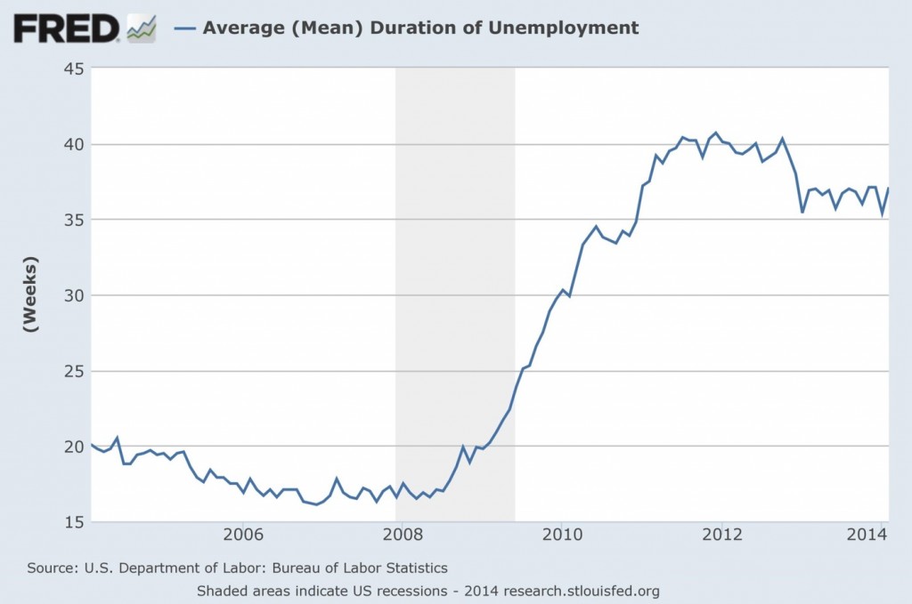
This graph shows that the length of time Americans are unemployed isn’t improving very much at all. See the bit about jobs not being created fast enough, above, for a major contributor to this failure. This is a problem that tends to be self-perpetuating, too. The longer folks are out of a job, the more of their skills they lose; if they were in a high-skill, and/or information intensive job (engineering comes to mind), the more obsolete they become, too, as they aren’t as able to keep up with the new data in their field as are those still employed—or even the newly graduated.
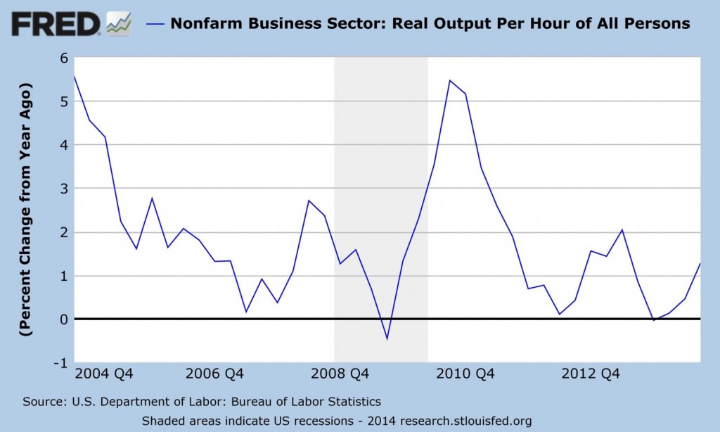
Productivity growth, output per hour by an employee, or what he produces in his hour of working, isn’t very much at all. Most of the jobs that are being created in this pseudo-recovery are service jobs. There are only so many tables a waitress can handle in an hour, only so many disgruntled customers a Customer Service Representative can handle in an hour, only so many investors a brokerage’s Investment Advisor can handle in an hour.
This…recovery…is, to use the Institute’s term, anemic. But we knew that from last week’s GDP growth number. And all of you still looking for work, or who’ve given up on that, have known this for some time.

