
Progressive-Democratic Party Presidential candidate Joe Biden is extremely proud of the economy he and his BFF and mentor ex-President Barack Obama (D) created for us. Here are some graphs generated by the Federal Reserve Bank of St Louis that illustrate the magnificence of their creation, via The Gateway Pundit.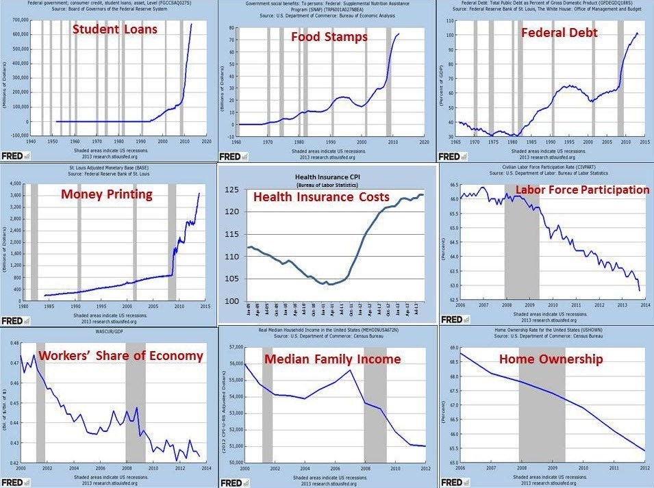
The X-axis is hard to read (right-clicking on the image and selecting View Image brings up a bigger image), but the right-most vertical gray band is the Panic of 2008, and the time frame following that includes the bulk of the Obama-Biden administration.
Notice a few things in particular, about which Biden has the most loudly bragged. The Federal debt spiked hard from the Obama bailout, and it continued to run up hard.
Health care costs ran up hard after the passage of his Big F*ing Deal Obamacare, and continued to rise after that, albeit at a lower rate.
Labor Force participation fell during the Panic, and then fell even harder for years during the Obama-Biden years after the Panic’s end.
Worker share of our economy fell some during the Panic, and then it fell hard, and stayed down, during the Obama-Biden years after the Panic’s end.
Median family income fell during the Panic, then it fell harder, and stayed down, during the Obama-Biden years after the Panic’s end.
Run on that accomplishment, Joe. I double dog dare you.