
Watts Up With That has a summary article and graph on this; the basic article is on the other side of a link in the summary. It’s typically academic in its language, but it’s well worth a layman’s time in slogging through. Here’s the graph (which is a construction of Watts’; it’s not in the linked-to article):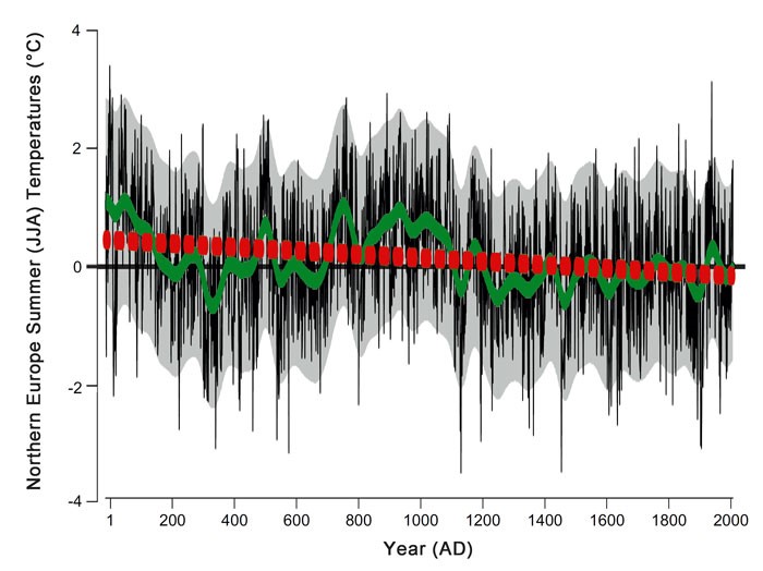
Northern Europe summer (June, July, August) temperature reconstruction. Data shown in °C with respect to the 1961-1990 mean. Adapted from Esper et al. (2014).
The black lines are individual data points, and the grey shading smoothes the data. The green line represents the center of the grey shading, and the red line approximates a regression line showing the long-term rate of cooling over these 2,000 years. All the representations show the same thing: it was warmer in northern Europe 2,000 years ago, during the time of the Roman Empire, than it is today.
The take away for me, though, is what’s represented by the black lines and the grey shading. Compare those to the alleged warming trend of the last 100 years—and its stagnation over the last 20 years (fully a fifth of those 100 years).
Now show that that recent “trend” is distinguishable from the noise level apparent in the data and their first smoothing, the grey shade.