An Example of Centrally Managed “Capitalism”

In the People’s Republic of China, reports The Wall Street Journal, the urban population has, for the first time in Chinese history, now exceeded the rural population.  This situation serves as a backdrop for some of the problems in China’s centrally managed economy.

One problem involves access of the newly migrated people to public services in their new cities—accesses their already resident neighbors have.  It seems Chinese can only have access to public services in the towns and villages they’ve just left, because that’s where their families have been registered.  Under China’s household registration system—intended to rationmanage access to such services so as to prevent their being overwhelmed—only registered households can avail themselves of the public’s weal.

More importantly, such property rights as a Chinese citizen might have, have gone by the boards.  It seems that city—and village—managers are seizing farmers’ land that lies on the margins of the rapidly growing cities, and on the edges of the just departed villages, too.  In fact, farmers on the outskirts often are willy-nilly uprooted and moved into apartment complexes so their land, including the old homestead, can be consolidated into larger tracts.  Bigger farmers know better how to run the farmland, after all, and more lucratively, developers can take the land out of production and turn it into shopping malls and luxury homes for the growing populations of middle class and wealthy.  Just to rub salt into the farmers’ wounds, the urban leadership pays the farmers a token for their land (it’s not an outright confiscation), and then charges market rates as they flip the land to developers, pocketing the difference—ostensibly for the town or city budget.

The Chinese government seems powerless to stop this.  The local central managers insist they need the income from their land flips to “maintain growth, service debt and top up their budgets.”  Further, pressure to continue the practice will continue: Beijing intends to build an additional 36 million units of affordable “social housing” just in the next 5 years.  Those buildings have to sit somewhere.  And this doesn’t consider the ordinary housing building that will occur for those who don’t need “social housing,” or all the building for all the supporting infrastructure—schools, shopping malls, government buildings, roads and streets, and the like—that will go up along with all that housing construction.

Hmm….
Government Intervention Gone Awry

Peter Suderman, writing for Reason, suggests that Obamacare, far from being the cost saver the Progressives insist it to be, actually is a cost increaser.  It seems that Obamacare is inflating health benefit costs at a sharply more rapid pace than was the rate of increase before Obamacare’s ram-through.  According to a series of Kaiser Foundation annual surveys of employee health benefits, in 2008, the cost increase for employer-provided family health benefits was 5%.  In 2009, the cost increase was 5% again, and in 2010—the year Obamacare was passed before anyone was allowed to know what was in it—the cost increase was only 3%.  But in 2011, that cost increase was 9%.  And it’s going to get worse.

This is reminiscent of another government intervention into our health care system: the creation of Medicare.  Under the Johnson administration, Medicare (and Medicaid) were established as interventions in the market for medical services because government Knew Better then, too, how markets should work.  Far from reducing costs, though, these programs also made the situation worse.  In the year before Medicare was passed, the cost of a hospital bed was rising at 5% per year—three percentage points above the overall rate of inflation for that year.  By the fifth year following Medicare’s enactment, the cost of that same hospital bed was rising at 8% per year, a 60% increase in the rate of inflation for that bed, against a baseline, still, of just 4% overall inflation—the relative cost of a bed had doubled.  Further, the combined “advantage” of Medicare and Medicaid, through 2001, accounted for fully 25% of the inflation in the overall cost of medical care.  The tax exempt status of employer-provided medical coverage (another “boon” for the individual), accounted for another 33% of the inflation in total medical services cost: these two government interventions were responsible for nearly 60% of the inflation in the cost of medical care.

Medicare premiums themselves have risen rapidly since the inception of the program.  1965’s $3 per month premium had risen to $94.60 in 2011.  If the premiums had only risen with general inflation, they would be in the $14-$15 per month range today.  Additionally, the doctor and hospital reimbursement rates—those Medicare-approved amounts—are too low to allow the doctors and hospitals involved to recover their costs.  As a result, these health service providers are driven increasingly to refuse Medicare patients altogether.  Despite this, Medicare participation is mandatory: Americans must purchase Medicare, whether they want it or not, even in the face of this dwindling service, and this artificially elevated demand for a decreasing supply also contributes heavily to cost increases.

Mandatory participation in Medicare has not achieved the goal claimed for it: an overall reduction in the cost of health services.  It is, though, succeeding in reducing the availability of medical services generally.

And so it is with Obamacare.  New mandates—the Individual Mandate, requirements that insurance companies cover people’s health condition, regardless of risk and at government mandated price ranges—increase demand.  Although there are those price controls, the regulations will drive insurers increasingly out of an increasingly unprofitable market, and this will drive costs upward in the form of inaccessibility of health services and long waits.  Further, Obamacare’s tax hikes will be passed on to consumers.  There are those price controls, but as we saw with the Nixon price controls, ways will be found around them.

Rest assured, also, the quality of care will fall through the floor, too.  There’s another Obamacare regulation: medical loss ratios, whose values are mandated under Obamacare, require insurers to spend a high percentage of their premium revenue on federally defined clinical services (Government-mandated, not market-driven, and so not necessarily wanted by us), and this is at the direct expense of R&D.  And of course health insurers are interested in research—not only in how to better provide insurance products to customers (there are profits to be made in offering better products and doing so more efficiently, and without those profits, the search for more and better won’t occur), but also in medicine itself.  Medical research is part of that search for profit: more, and more efficiently provided, medical services also are profitable, as is a long-lived, healthy customer base.  Only now there’ll be less money available for that research.

Once again, we’re stuck with an artificially elevated demand for dwindling supplies, and this time supplies of decreasing quality as well as quantity.

Made in Germany

The EU is at it again, still trying to manage economies, and this time they’re taking on the German powerhouse whose piggy bank they want to raid directly to bail out the rest of Continental Europe.

Spiegel International Online reports

Whether it’s attached to a car, a dish washer or a pepper grinder, the “Made in Germany” label is key to selling products made in the country. But if the European Union has its way, goods carrying the tag will soon have to comply with higher standards….

EU Commissioner Algirdas Semeta plans to restrict the sought-after “Made in Germany” label to products where at least 45 percent of the value content comes from Germany. Until now, EU rules defined the country of origin as the place where “the last substantial, economically justified processing” took place.

Spiegel reports further that a part of the beef is that, under the current regulatory régime,  products could be produced almost entirely outside of Germany (for instance), and only the finishing touches applied in the domestic factory.  This is an exaggeration, or it would be in a truly open, information-flowing free market—something that’s been anathema to the Europeans for decades, and which lack underlies the current European economic malaise.

In the modern globally integrated economy, “Made in Germany/France/United States/etc” has been a bit of a misnomer for a long time: “Assembled in…” would be more accurate.  German—and American—automobiles, for instance, are built up from parts made in a number of foreign locations where labor is cheaper and necessary supplies, especially commodity supplies (iron, plastics, and so on), are nearer by and so cheaper to obtain.  Then the parts are shipped for final assembly in Germany or the US.  To do the whole thing overseas, only applying the last coat of paint in the domestic factory, and claiming that to be domestically made would, at best, irritate an informed market’s public, and it would eliminate the value of any “Made in” claim.  Businessmen aren’t smarter than their customers, nor need they be better informed.

Moreover, in the near term, and in perpetuity, bureaucratic imperatives involved in the record keeping needed at all “production stages to establish where most of the value of the product was created,” assuming “most of the value” could be defined adequately, will only increase production costs—and so costs to the consumer who’s being “protected” by this foolishness.

EU leadership is both exposing its jealousy of German success and demonstrating once again how the euro zone is too fractionated to support a common currency and how the EU itself is too fractionated to support the tighter integration that many want and that the Brits have correctly eschewed.  And the European political class is demonstrating once again its contempt for the intelligence and wisdom of the common man whom it purports to represent.

Some Thoughts on Freedom and Income

I guess today is my day for pretending to think.

Progressives have been trying to score political points by bellyaching about income inequality and pretending there’s something to this.  A couple of graphs from the Fraser Institute’s Free the World project bear on this.  The graphs below, in particular, are from their report for the year 2008; their latest report, dated 2011, covers the year 2009, and it’s not materially different vis-à-vis the poor.  Emphasis added, and kindly excuse the poor formatting.

The Institute’s reports also rank the world’s nations along various dimensions of economic freedom; there is a significant degradation in our freedoms and rankings between 2008 and 2009, as I’ll mention at the end.

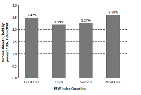
Exhibit 1.8: Economic Freedom and the Income Share of the Poorest 10%

The share of income earned by the poorest 10% of the population is unrelated to economic freedom.

Sources: Fraser Institute, Economic

Freedom of the World: 2010 Annual Report;

World Bank, World Development Indicators.

Now let’s look at another aspect of the poor’s situation.

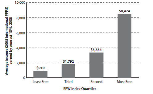
Exhibit 1.9: Economic Freedom and the Income Level of the Poorest 10%

The amount, as opposed to the share, of income earned by the poorest 10% of the population is much higher in countries with greater economic freedom.

Sources: Fraser Institute, Economic

Freedom of the World: 2010 Annual Report;

World Bank, World Development Indicators.

This is dramatic.  While the poor’s share of the wealth is independent of the degree of freedom in the country in which they live, their wealth in absolute terms is enormously greater, and it gets more so as the degree of freedom increases.  The poor of a free nation are far better off than the poor of a tyranny.  Of course this is not reason to disregard the relative plight of the poor in any nation.  Certainly, after (and only after) private and local community aid efforts for the needy (who are, in fact, only a subset of the poor) have been exhausted, an argument exists for aid at the state level (now speaking for the United States alone), to be followed—only as a last resort—by  Federal assistance to state-tailored and -run work-for-assistance programs for the few remaining that need assistance.

One more thing: where the US sits on the freedom scale is instructive.

The following small table is excerpted from Exhibit 1.5 from the same report as the graphs above.  The year is the year for which the rating is valid; the ratings themselves are on a scale from 1-10, with 10 being most free.  For context, the US is rated as 6th most free in the world, overall, with Hong Kong the freest and Chile ranked number 5.

Year        1970  1975  1980  1985  1990  1995    2000    2001    2002   2003   2004  2005  2006  2007  2008

US          7.74    7.83    8.03    8.18   8.43   8.32    8.45     8.23     8.22    8.17     8.15   8.07    8.01    8.08   7.93

Hong Kong 8.99   8.85   9.21   8.81   8.76   9.11    8.82     8.76     8.76    8.81     8.75   8.94    8.95    9.00   9.02

Chile      4.31   3.93    5.56    6.18    7.02   7.47    7.28     7.47     7.59    7.75     7.67   7.94    7.97    8.08   7.99

Notice the freedom trend for the US.  We were at our freest in 2000, then the Federal government began increasing the degree of regulation it forced onto our economy—both business and individual.  Yes, the Progressive rap on the Bush years is that he deregulated, and did too much of it.  But on this, as with so many things, the Progressives are wrong.  By 2008, the US only ranked 26th in our freedom to trade internationally and our business regulatory controls.  Appallingly, our credit market regulatory regime ranked only 103rd.  (As an aside, despite Congressman Ron Paul’s concern about the soundness of our money, as of 2008, we ranked number 2, with Japan at number 1.  Of course a lot has changed since 2008: in 2009, our rank fell to 11.)

And the degree of regulatory control has exploded under the Obama administration.  This has driven our ranking in overall regulatory freedom from 17th in 2008 down to 27th just in Obama’s first year, 2009 (we were 2nd in 2000).  Associated with this, the per centage of Americans living below the Federal poverty level has grown to historic highs these last three years.

More on (Un)Employment

The Weekly Standard‘s Jay Cost has some thoughts on the recently reported headline jobs data.  The perspective into which these headline data fit can be neatly summarized in a table and a graph.

One aspect of this perspective is the overall economic situation in which the present data sit.  This table shows that situation for the last several Presidential election years. It’s true enough that the President Obama’s Employment growth number isn’t too different from those of past presidents in election years.  Keep in mind, though, that Obama’s number is for employment growing from an historically low employment condition: in December 2009, after a year of Obama Stimulus, unemployment was over 10%, with 15 million Americans unemployed.  Obama’s policies in 2011 have produced 0.52% annual growth against that start.  In short, we’re maintaining/growing employment very slightly at our present high unemployment rate, just as during the Clinton and Bush the Younger years, we maintained/grew employment very slightly in a time of already full employment.

Now look at those 2011 GDP and Income growth rate numbers.  They haven’t been that bad—our economy hasn’t been in such sad shape—since the Carter years.  That nearly flat employment growth rate is occurring in a terribly weak economy.

Now let’s look at the unemployment rate itself.  Cost’s graph is informative here.

Just in case the legend isn’t clear/legible, the blue line is the Official unemployment rate, as reported by the Obama administration.  The red line is the “Shadow” unemployment rate, about which neither this administration nor the NLMSM want to talk much.

As Cost points out, much of the decline shown on the Official unemployment (but not all, to be sure) is caused by the shrinking work force, as long-term unemployed give up and stop looking for jobs.  Indeed, as Cost says

Because of the length of this jobs recession, the number of people who claim to be in the workforce is near a 30-year low, and it has dropped substantially since Obama first took office (from 65.7 percent to 64 percent).

and

If we recalculate the unemployment rate based on the percentage of adults who said they were in the workforce at the start of Obama’s tenure, we get [the “Shadow” unemployment rate shown by the red line].