
A Few More Thoughts on Employment

The Beveridge Curve is a means of depicting the relationship between the unemployment rate and the number of jobs available in an economy.  An example of this curve is given by a Federal Reserve Bank of Cleveland article, which asks “Has the Beveridge Curve Shifted?” and is presented below.

Moves along the curve indicate increasing job openings in a growing economy associated with decreasing unemployed workers, or decreasing openings with increasing unemployment in a shrinking economy.  The curve itself can move, also, as structural mismatches between employers’ needs and employees’ capabilities change.  Such mismatches can be driven by technology that creates a gap between skills needed and skills possessed, or job location vs employee location—or by long-term unemployment, which destroys existing job skills that otherwise would be a good match for existing skill needs.

But in such cases, we’d expect the curve to shift back as such mismatches clear (and shift again, as new mismatches develop).  It’s normal for economies to expand and contract on a shorter time frame, though, than that on which structural shifts occur—it can take months or years to retrain, for instance, whereas an economy can contract in a matter of months (typically, in the US, the current dislocation, or those of the 1970s or 1930s notwithstanding).  In fact, the Fed’s article points out that such movements of the curve itself are normal behaviors for our economy in the post-war period.

That’s a long-winded entry into the purpose of this post.  There are two graphs that indicate the failure of the present administration’s economic policies, especially as those policies impact employment capabilities in our economy; both of these are from  Sober Look.  The first graph is this one:

This shows just the sort of structural shift described above, and the shift didn’t occur until after the recession was over—and recall that the recession ended in Spring 2009, before any economic policies of Democratic Presidential Candidate Barack Obama could have taken effect.  Even his $800 billion Stimulus Act spending had not had time to have any effect at the time of the recession’s official end.

Notice that the pre-recession unemployment vs job openings part of the curve is entirely consistent with what we’d expect in a healthy economy—lots (relatively) of openings and full employment, with fewer openings associated with moderately higher unemployment.  During the recession, the decreasing availability of jobs and increasing unemployment followed that curve all the way out to the peak unemployment near 10%.

After the recession, though, and since—a period in which Obama’s economic policies have been able to have their full effect—we see the curve’s shift: even though jobs are becoming more available, unemployment is remaining high, and the drop-off in unemployment, such as it is, is following a higher level of jobs availability—there is a higher mismatch between jobs and job seekers.

This next graph illustrates a major reason why.

This graph shows the number of Americans who’ve been out of work for 27 weeks (6+ months) or more as a per cent of total unemployed.

Notice that sharp, and so far sustained, rise in this long-term unemployment during Obama’s term.  This long-term unemployment produces one of those mismatches described above—the skills mismatch, this time driven by skills destruction through non-use from that long-term unemployment.  Obama’s policies are actively suppressing re-employment.  Even as the preceding graph implies that there are more jobs available now than at the start of his term, job seekers can only find jobs from an increased amount of availability than was the case before the present policies were in place.  The increase in jobs available just isn’t enough to absorb our high unemployment.
Growing Foreign Oil Dependency

Amid claims by the Obama administration that we need to reduce our dependence on foreign oil—and actual Republican and conservative efforts actually to do so by opening up access to our own gas and oil supplies, protect our coal producers, and their failed effort to facilitate American purchase of Canadian oil—we get this, from The New York Times, no less.

The United States is increasing its dependence on oil from Saudi Arabia, raising its imports from the kingdom by more than 20 percent this year, even as fears of military conflict in the tinderbox Persian Gulf region grow.

The increase in Saudi oil exports to the United States began slowly last summer and has picked up pace this year. Until then, the United States had decreased its dependence on foreign oil and from the Gulf in particular.

If the Obama administration weren’t slow-walking permits for off-shore drilling, closing off Federal lands to oil and gas development, and attacking natural gas fracking, we’d be getting access to increased American oil—and a major product substitute, gas—right about now, instead of having to buy more oil from Saudi Arabia, and thereby enriching a nation that has closed off Israeli access to its airspace should our erstwhile ally want to preempt an Iranian nuclear strike by attacking Iran’s nuclear facilities.

If the Obama administration hadn’t closed off American access to Canadian oil by killing the Keystone XL pipeline, and thereby pushed Canada to sell its oil to the People’s Republic of China (which has its own purposes for getting Canadian oil), we’d have reduced further our dependence on oil from countries that don’t like us all that much.

Some Notes on Energy Subsidies

Here are some data taken from the US Energy Information Administration’s report Direct Federal Financial Interventions and Subsidies in Energy in Fiscal Year 2010.

The following table is excerpted from the EIA report’s Table ES4, and it shows the amount of subsidy that each energy source received along with the per centage of the total of nearly $12 billion in subsidies handed out that each energy source received.

2010 Total (millions)

Share of Total Subsidies and Support

oal $1,189 10.0%
Natural Gas and Petroleum Liquids $654 5.5%
Nuclear $2,499 21.0%
Renewables $6,560 55.3%
    Biomass $114 1.0%
    Geothermal $200 1.7%
    Hydropower $215 1.8%
    Solar $968 8.2%
    Wind $4,986 42.0%
    Unallocated
Renewables
$75 0.6%
Transmission and Distribution $971 8.2%
Total $11,873 100%


This table, excerpted from the report’s Table ES5, gives an indication of the relative amount of energy we taxpayers are receiving for our subsidy.

Share of 2010 Generation (percent)

Coal 44.9%
Natural Gas and Petroleum Liquids 25.0%
Nuclear 19.6%
Renewables 10.3%
    Biomass Power 1.4%
    Geothermal 0.4%
    Hydroelectric 6.2%
    Solar 0.0%
    Wind 2.3%
Total 100.0%


Notice that: coal, natural gas, and oil get 15.5% of the total subsidies while producing nearly 70% of our nation’s energy; renewables get over 55% of the subsidies and produce just 10% of our energy.

As the Wall Street Journal tells us that DoE, which owns the EIA,

…warned that “Focusing on a single year’s data does not capture the imbedded effects of subsidies that may have occurred over many years” for other energy sources.

Of course.  Because if we did consider such things, we’d have to notice that renewable energy subsidies have been costing taxpayers for 40 years—since the ’70s—with next to nothing to show for it.

“Get rid of the subsidies for the fat-cat oil and gas companies,” says Democratic Presidential Candidate Barack Obama.  Ignoring the snide tone of his remark (albeit paraphrased by me), I agree—get rid of the oil and gas company subsidies.  Get rid of the alternative energy subsidies, too.  If the (renewable) energy industry cannot survive in the market on its own, this simply demonstrates that the industry isn’t ready for the market.

At least the oil and gas and coal companies, with their subsidies, are generating actual electricity, though: look at solar—it’s getting 8% of the total subsidies handed out, and generating no electricity (can you say, “Solyndra?”).  Not a watt, except for rounding error to get to that zero.

A Modest Proposal for Financial Law

Standard Chartered PLC agreed to pay a $340 million “fine” for improper financial transactions amounting to $250 billion, a fine of just a tad over 1% of that total.  Judge Jed Rakoff, of the United States Federal District, refused to sanction a proposed settlement between the SEC and Citigroup Global Markets of a $160 million “fine” for an improperly handled billion dollar CDO fund, arguing in part that there was no basis for a punitive settlement when there was no allegation or admission of a wrongdoing.

It is, in fact, routine for supposedly misbehaving financial entities and their Federal regulators to negotiate such chump change fines, whether or not actual wrongdoing is conceded or alleged.  This disconnect between the sanction and the (phantom) misbehavior generally is not the result of cronyism; all the players are, say I, fundamentally honest.  No, such settlements are driven by the complexity of our financial laws, of which Dodd-Frank is only the latest addition.  The defendant financial institution usually finds it cheaper to pay the government’s vig than to defend itself, even when innocent, and the government usually finds it cheaper to charge only a taste and make no demand for admission of wrongdoing than to prosecute a case.

As a result of this unnecessary complexity, the government simply continues to hector the financial institutions and the financials simply continue to misbehave (my remark about honesty not withstanding) with the settlements just part of the cost of doing business.

Accordingly, a modest proposal.  Get rid of the financial laws and the regulations.  Replace them with a few simple laws (which, in their simplicity will need no implementing regulations) to the effect of honoring freely signed contracts, the products sold having to be openly and clearly described, all parties to the contracts, and their roles, having to be clearly and openly described.  There might be one or two others, but you get the idea.

Then get serious about cases.  If these laws are violated, hale the miscreants into court and go for serious penalties.  No more “negotiating” pocket money payments.  That’s like negotiating with Willie Sutton over his “community service.”  $250 billion in illegal trades ought to get that much as the floor of a fine.  If that puts the misbehaving company out of business, I suggest that a criminal organization won’t be missed.

Government Keynesian Waste

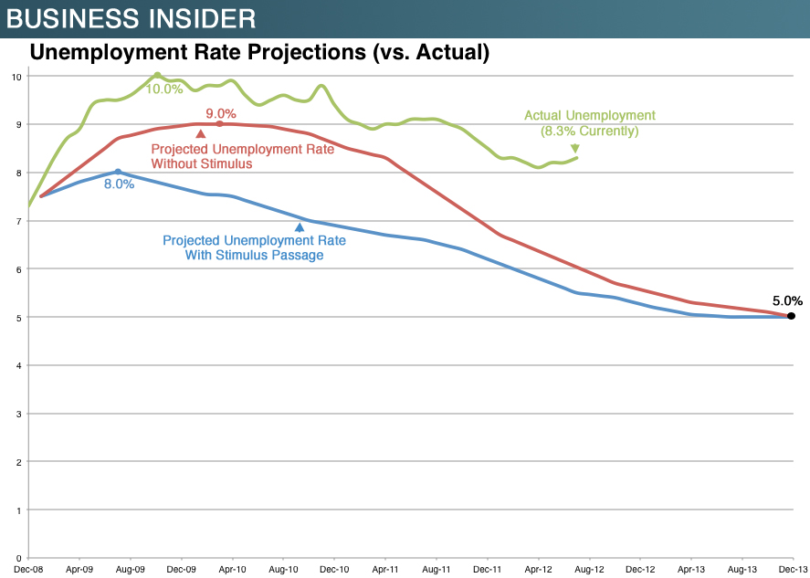
As if there’s any more need to demonstrate the fallacy of Keynesian stimulus pseudo-theory after its failure in the ’30s, some empirical evidence from today’s economic dislocation and failed “recovery” is neatly summarized in the following graph from Business Insider:

Most are already familiar with those projection curves, from the 2009 hype associated with ramming the American Recovery and Reinvestment Act of 2009 (the Stimulus Act) through the Democratic and then-economically timorous Congress.  Government standing aside and letting the economy recover on its own was going to let unemployment peak at around 9% and not move below 7% until Dec 2011 or reach “full” employment until Dec 2013.  On the other hand, the Obama Stimulus would cause an almost immediate peak (in August 2009 after a February enactment) at 8% and lead to recovery below 7% unemployment by fall 2010, a year sooner than under non-interference.

Instead, the Obama Stimulus has actively suppressed employment—and so economic recovery.  Unemployment, at roughly 8.5% at the time of stimulus enactment, continued rising unabated to above 10%, and it has remained above the worse-case no-government projection ever since.  Notice further, that actual unemployment has generally followed the shape of the no-government projection curve: the only effect of Obamanomics in this milieu has been to make government involvement worse than no involvement—it hasn’t altered anything else.

Do we have empirical data for the contrary position, that government noninvolvement is actively beneficial?  You betcha.  The Depression of 1920-1921 ran from the start of 1920 through the middle of 1921, and President Warren G Harding’s administration sat it out, with no significant government intervention attempted.  The graph below is constructed from data taken from Table 9 in a paper by none other than Christina Romer.

There are a couple of takeaways here.  One is the sharp, high peak to unemployment and the rapidity with which both the peak and the recovery occurred.  Another is the rapidity with which our economy actually worked its way through this Depression compared to the projected recovery rates in the first graph above.  The projections for our current failing recovery are, compared to hard data, cynically pessimistic.  This pessimism, though, cannot be laid at Democratic Presidential Candidate Obama’s feet; a broad range of economists assumed that slow pace.

In general, to repeat earlier posts and statements made by others: money spent by government is money not available to the private sector or to individuals to spend on their own goals and needs.  Money spent by the government is money that first must be taken from those private enterprises and citizens in the form of taxes today to pay for that spending or greater taxes tomorrow to pay both for that spending and for the interest on the debt incurred by that spending.  And here we’ve seen empirical evidence that government spending, above a minimal level for funding government itself and national defense, isn’t just useless, it’s actively counterproductive—destructive.