I guess today is my day for pretending to think.
Progressives have been trying to score political points by bellyaching about income inequality and pretending there’s something to this. A couple of graphs from the Fraser Institute’s Free the World project bear on this. The graphs below, in particular, are from their report for the year 2008; their latest report, dated 2011, covers the year 2009, and it’s not materially different vis-à-vis the poor. Emphasis added, and kindly excuse the poor formatting.
The Institute’s reports also rank the world’s nations along various dimensions of economic freedom; there is a significant degradation in our freedoms and rankings between 2008 and 2009, as I’ll mention at the end.
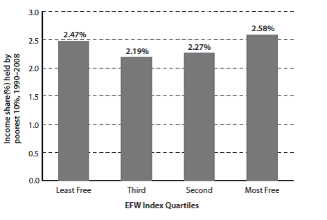
Exhibit 1.8: Economic Freedom and the Income Share of the Poorest 10%
The share of income earned by the poorest 10% of the population is unrelated to economic freedom.
Sources: Fraser Institute, Economic
Freedom of the World: 2010 Annual Report;
World Bank, World Development Indicators. 
Now let’s look at another aspect of the poor’s situation.
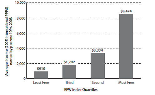
Exhibit 1.9: Economic Freedom and the Income Level of the Poorest 10%
The amount, as opposed to the share, of income earned by the poorest 10% of the population is much higher in countries with greater economic freedom.
Sources: Fraser Institute, Economic
Freedom of the World: 2010 Annual Report;
World Bank, World Development Indicators. 
This is dramatic. While the poor’s share of the wealth is independent of the degree of freedom in the country in which they live, their wealth in absolute terms is enormously greater, and it gets more so as the degree of freedom increases. The poor of a free nation are far better off than the poor of a tyranny. Of course this is not reason to disregard the relative plight of the poor in any nation. Certainly, after (and only after) private and local community aid efforts for the needy (who are, in fact, only a subset of the poor) have been exhausted, an argument exists for aid at the state level (now speaking for the United States alone), to be followed—only as a last resort—by Federal assistance to state-tailored and -run work-for-assistance programs for the few remaining that need assistance.
One more thing: where the US sits on the freedom scale is instructive.
The following small table is excerpted from Exhibit 1.5 from the same report as the graphs above. The year is the year for which the rating is valid; the ratings themselves are on a scale from 1-10, with 10 being most free. For context, the US is rated as 6th most free in the world, overall, with Hong Kong the freest and Chile ranked number 5.
Year 1970 1975 1980 1985 1990 1995 2000 2001 2002 2003 2004 2005 2006 2007 2008
US 7.74 7.83 8.03 8.18 8.43 8.32 8.45 8.23 8.22 8.17 8.15 8.07 8.01 8.08 7.93
Hong Kong 8.99 8.85 9.21 8.81 8.76 9.11 8.82 8.76 8.76 8.81 8.75 8.94 8.95 9.00 9.02
Chile 4.31 3.93 5.56 6.18 7.02 7.47 7.28 7.47 7.59 7.75 7.67 7.94 7.97 8.08 7.99
Notice the freedom trend for the US. We were at our freest in 2000, then the Federal government began increasing the degree of regulation it forced onto our economy—both business and individual. Yes, the Progressive rap on the Bush years is that he deregulated, and did too much of it. But on this, as with so many things, the Progressives are wrong. By 2008, the US only ranked 26th in our freedom to trade internationally and our business regulatory controls. Appallingly, our credit market regulatory regime ranked only 103rd. (As an aside, despite Congressman Ron Paul’s concern about the soundness of our money, as of 2008, we ranked number 2, with Japan at number 1. Of course a lot has changed since 2008: in 2009, our rank fell to 11.)
And the degree of regulatory control has exploded under the Obama administration. This has driven our ranking in overall regulatory freedom from 17th in 2008 down to 27th just in Obama’s first year, 2009 (we were 2nd in 2000). Associated with this, the per centage of Americans living below the Federal poverty level has grown to historic highs these last three years.
