
The Wall Street Journal had a piece on shifting bank deposits, and in that article was an interesting graph. The article itself is worth the read, but the graph has, I think, wider import.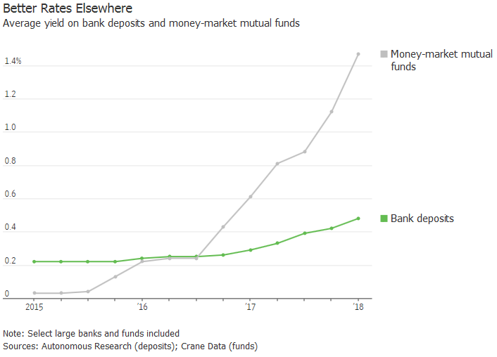
The graph illustrates the differing rates between what banks pay on depositors’ accounts compared to what money market funds pay, but look at the rates as indicated on vertical axis. Plainly, these aren’t the heady days of the early ’90s when money market funds like Dreyfus’ Worldwide Dollar Fund was paying in the region of 6%-8%. This graph, instead, illustrates the effect of the Fed’s continued suppression of market interest rates, even if they are—slowly—allowing their benchmarks to come up a bit.
Who cares about these rates, besides businesses? Folks on fixed income, folks illustrated by the stereotypical widows and orphans, who have no other sources of income. More normal market interest rates are in the region of 3%-4%.
The Fed needs to finish getting out of the way. But they’re not the only ones. Dodd-Frank suppresses banking competition. Too big to fail pits large banks against regionals and locals, but Dodd-Frank, by guaranteeing the big banks against failure, has eliminated competition among the big banks. Congress needs to get rid of Dodd-Frank so all banks will compete against all banks. And offer higher rates on savings and checking deposits.