
Here are some graphs, via The Wall Street Journal, that show why that headline rate of 4.6% isn’t all it’s cracked up to be.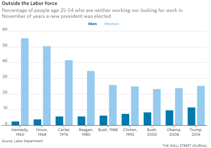
The WSJ emphasized two points here, aside from the fact that this age group being outside the labor force has nothing to do with retirement or being in school:
First, a small but ever growing minority of 25-54-year-old men are no longer in the labor force. In the 1960s, just 2.7% of men that age were outside the labor force. As of November, it’s 11.5%.
Second, from the 1960s to late 1990s, 25-54-year-old women became less and less likely to be outside the labor force (this is primarily driven by a decline of stay-at-home mothers, as more women took jobs). But in the last 15 years, the share of women outside the labor force has been growing too. It’s now up to 25.3% from 23.2% in November of 2000 just before George W. Bush took office.
Which might contribute to and why, perhaps, there’s so little wage growth, as shown in this graph: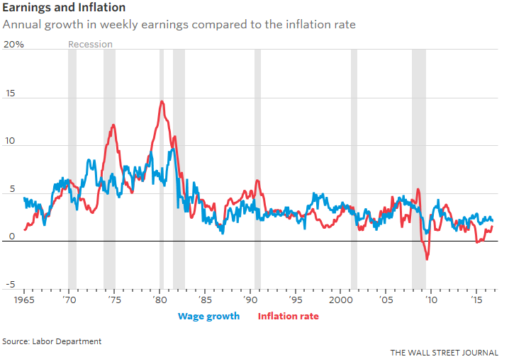
There’s just too much slack in the population’s ability to work.